Designed to Unite:
The Story of Amalgam’s Identity

THE CHALLENGE
Amalgam needed a inclusive identity that is memorable and approachable - representing diverse people and varied experiences while resonating with a broad audience in a competitive market.
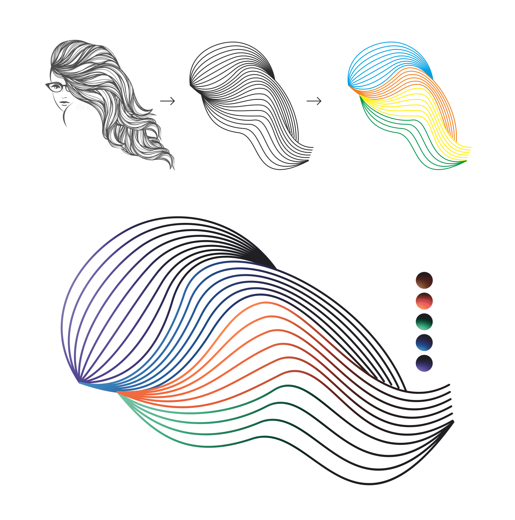
During the exploration phase, in deep conversations with the founder, a clear vision for the brand began to emerge. Amalgam isn’t just about events—it’s about crafting experiences that move people, sparking a wide spectrum of emotions and human connections. The founder described these moments as emotional waves—rising, falling, and peaking in powerful, memorable ways.
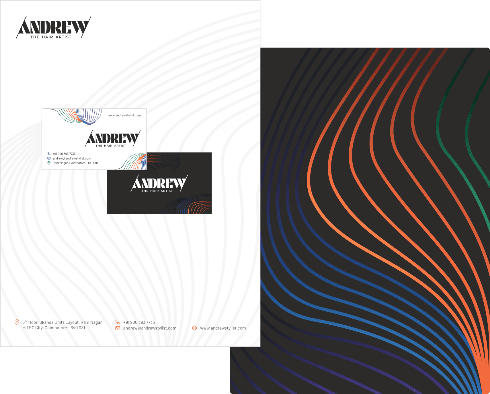
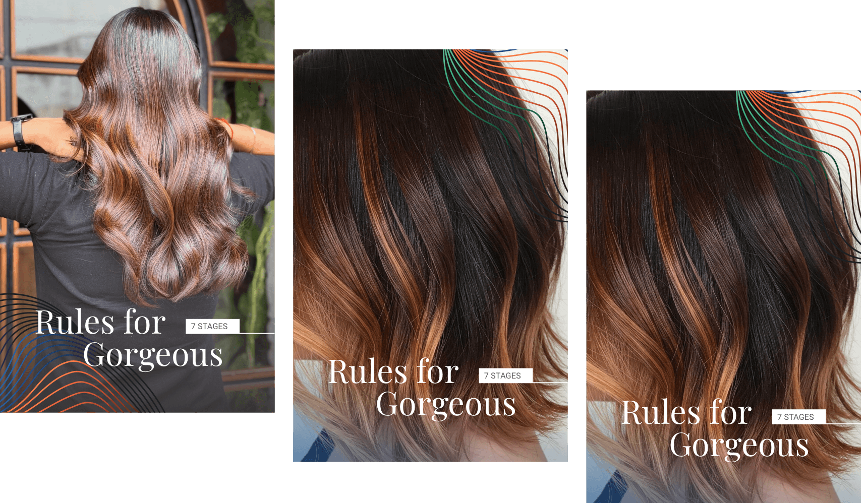
Inspired by this insight, I developed the concept of the “Wave of Emotions” as the core narrative for the brand identity. This idea became the foundation for a custom typeface—designed to visually echo the fluidity, rhythm, and dynamic energy of the emotional journeys Amalgam creates. The result is a brand identity that not only stands out visually but also resonates deeply with the human experience it represents.

Capturing Emotion Through Design
Working on Amalgam allowed me to dive deep into the psychology of events and human connection. It was a rewarding process of translating intangible experiences into a bold, meaningful design solution - one that truly captures the essence of what Amalgam stands for.